There is a big wave in ‘minimalist’ – I refuse to use the word ‘flat’ – design. I use quotes here because a lot of these designs tend to be only simple in aesthetics, instead of having a simplified feature set. It’s a fashionable thing to take something, deprive it of button shapes, styles and gradients and call it ‘minimal’.
Last year I thought of an idea for a browser that would be minimalist. Not necessarily in an aesthetic sense; I’d just like a browser that gets out of the way. Like the new (and unloved) design for Quicktime X introduced in Snow Leopard, I’d love to see a browser focusing solely on content, and generally offer a more visual approach to browsing the internet. ( – Yes, I mocked up a web browser again. I like doing it!)
Thus, the idea for ‘Helm’ was born. I designed this over a year ago and feel like there’s no chance it’ll ever become more than a set of Photoshop files, so I’m sharing my thought experiment here.
‘Helm’ is a hypothetical highly gesture-driven browser. This isn’t meant as a serious concept for a contender against Safari, but more or less as a concept that I’d enjoy to use. I’d love my browser to work this way. Its working title alone is meant as a play on words comparing the complexity of the navigational compass Safari uses in its icon to the intuitive ease of a ship’s helm for setting a course.
Helm would simply be a website. When interacted with, the user interface appears, but it disappears as long as you are interacting with the content instead of the control area.
You can navigate about a website like you usually do, in which case Helm slightly zooms out the page and animates the transition swiftly, much like Safari.
When the user needs feedback before taking an action or progress needs to be indicated, it gets away with that by showing it where the ‘status’ area normally is; Chrome already does this effortlessly.
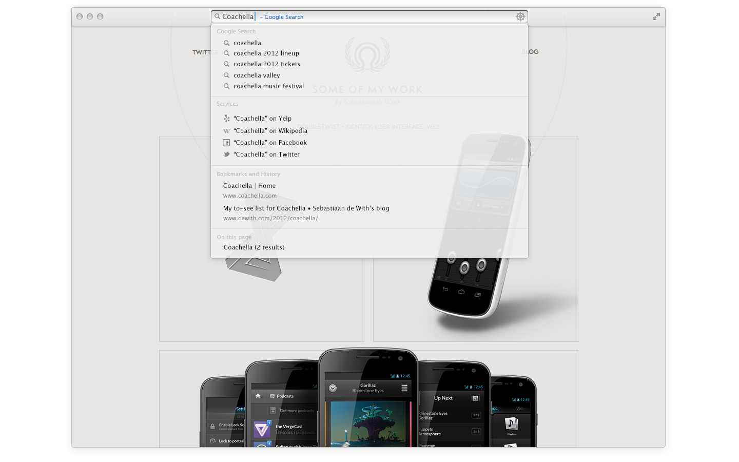
Typing anywhere on the page, unless it is in a text field, enables the user to act on it immediately. It’s a bit like Safari for OS X’s current multi-functional URL entry field / search field and the iOS Safari search field, letting users pick services for searches, searching within a page, and more:
This also applies to your ‘zoomed out’ view, which one can reach by either swiping back or ‘pinching’ the page out (this was mocked up before the current ‘pinched out’ tabs in Safari – these are fairly old mockups!). The top level view allows for open tabs that you can also ‘pin’ to essentially make a Top Sites / Speed Dial like Safari currently has. The pages won’t necessarily stay in memory: only pages where text has been entered. Helm could also keep track of changes in the website’s title, allowing for unread badges on pages like Facebook for new notifications, or an indicator for that one tab that’s been playing music (I go on this wild goose chase too many times).
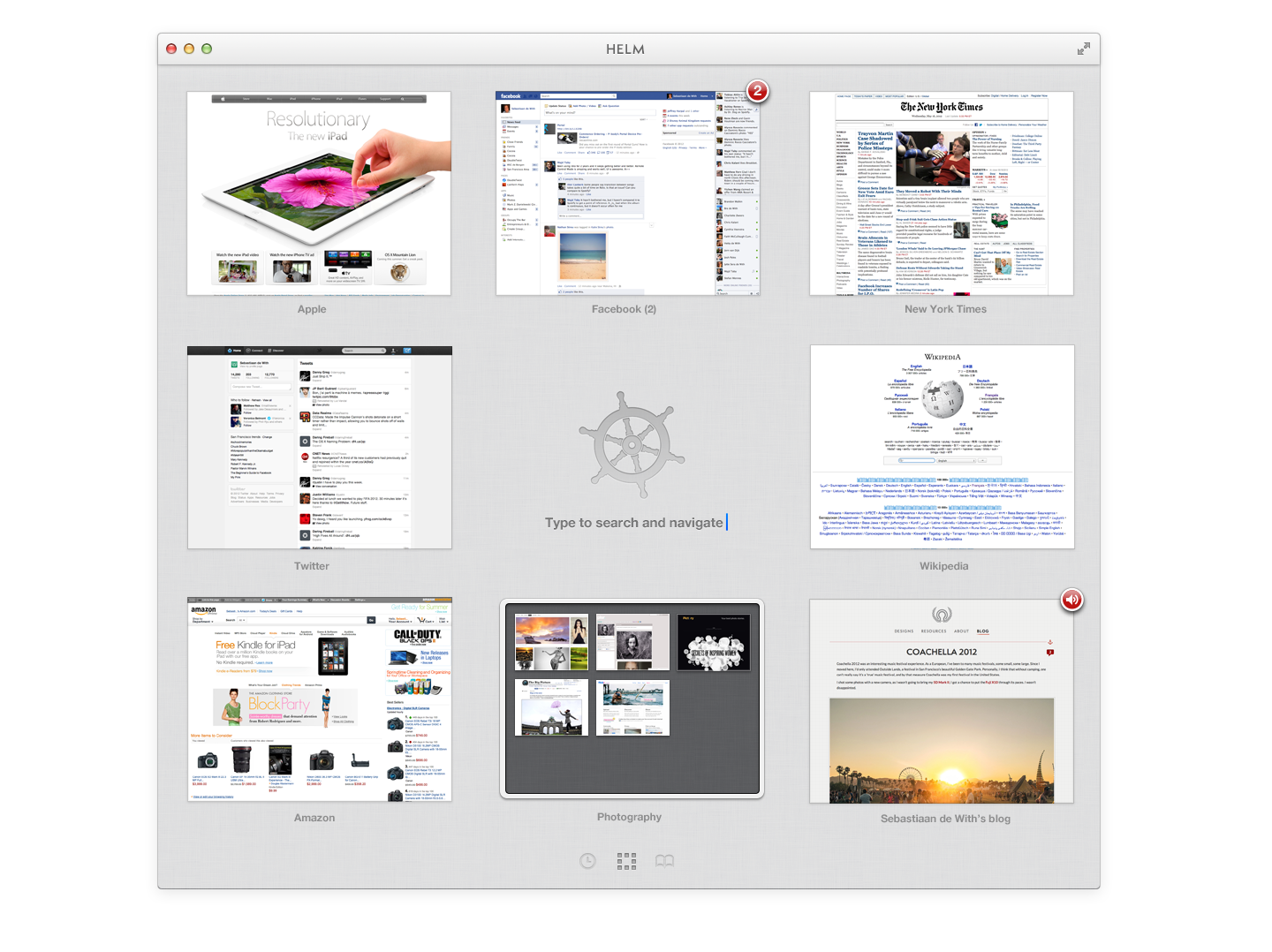
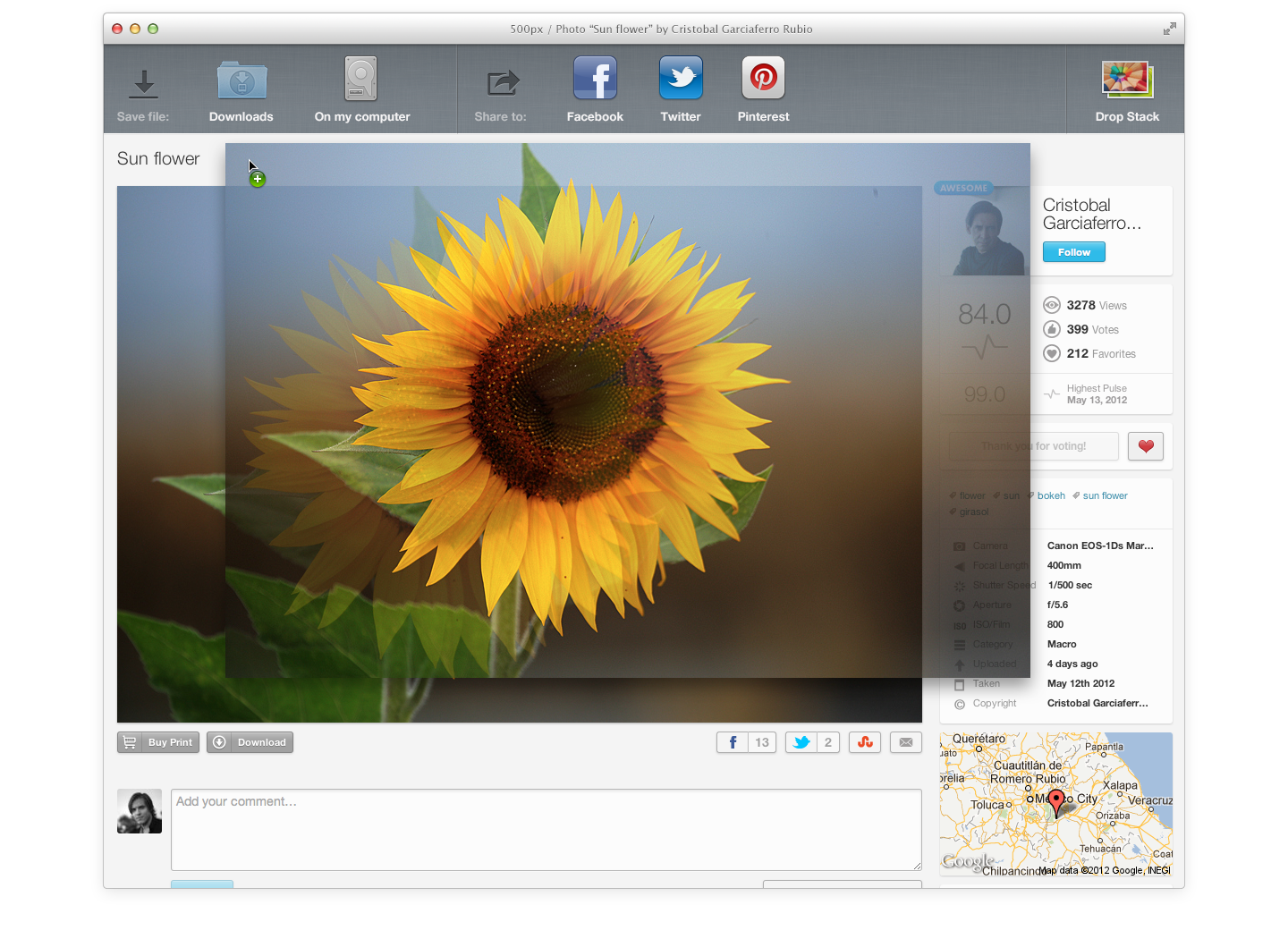
Helm is also a chance for me to revive pipe dream features like natively supported pop-out video and audio that I really want in browsers (yes, I still want this, damn it), and a full-screen Reader, and contextual controls that appear when, say, an image is dragged:
And that’s it. It’s flawed, it’s just a concept, but for one, I’d love something this simple. As opposed to Latitude, my old browser project, I won’t be making efforts to implement it like I did last time, but perhaps these ideas can inspire something. I felt compelled to share it.
Comments are closed.