doubleTwist Alarm has been an overwhelmingly successful project. It has received universal acclaim, from Google executives to design publications and many Android and gadget websites. Yet, the first question on anyone’s lips was always the same: “Why an alarm clock? Why would you take a swing at something so trivial and small, something so elementary to any cellphone made since the 1980s?”
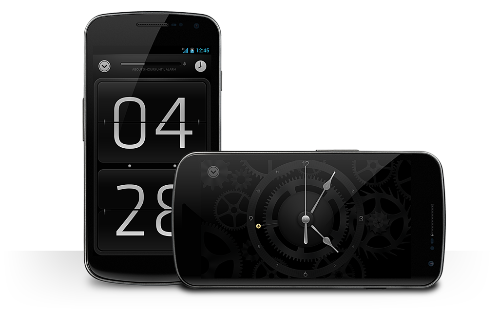
The answer is simple: because this is extremely essential tool we use every day. We wake up with it every morning — and it simply hasn’t been done right. It’s kind of terrible: you can compare it to waking up every morning to find you’ve been sleeping on a small pebble. To start your day off frustrated and displeased doesn’t just throw your mood into a funk, it can actually be quite unhealthy. Now there’s a problem that’s simply begging for a solution.

Designing the app was difficult. It wasn’t just difficult for the obvious reasons, like implementation details, aesthetic preferences, and because you want to add more and more to an application as you go along designing it, but also because Android is simply a really hard platform to design for.
Take for instance all the screen technologies and qualities between the hundreds of Android devices out there. doubleTwist Alarm uses a very dark color scheme to ensure it is pleasant to use in dark spaces and uses a small amount of battery power on most Android devices — AMOLED screens actually use over double the power of ‘normal’ screens, like the iPhone’s, when displaying bright colors — and it prompted numerous other designers to ask me what the secret was: how did we overcome the challenge of designing for such a wide target and ensure a legible design that didn’t appear banded, jagged or otherwise completely screwy on [insert screen technology]?
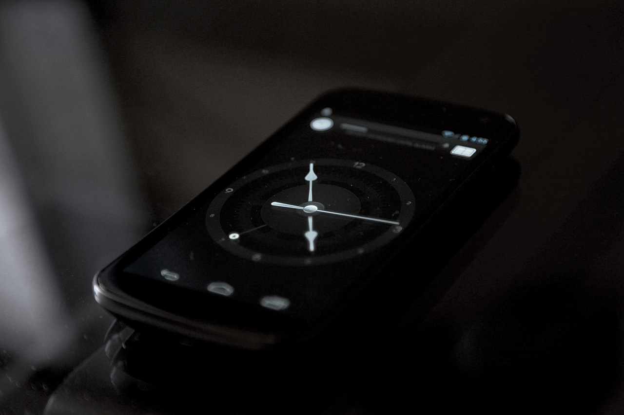
We tested the clock on various displays in a large variety of lighting conditions and settings.
The answer is quite simple: an exhaustive process of testing. Android devices come with TFT-LCD panels of varying quality and with various technologies: (S/)PVA, (S/H-)IPS, AFFS, each with their own unique dynamics and often manufacturer-calibrated specifically (yes, there’s different gamma curves), as well as AMOLED displays with similar varying characteristics. We tested them. Using remote viewing applications and a variety of lighting conditions, we verified gamma curves, color reproduction and our applications’ UI legibility and quality individually, time and time again.
Did we find a perfect solution? No. With this much variety, you have to surrender your notion of designing for perfection in one place, and find what is the best in all places.
Interesting things we found through researching Android screens in general:
- No phone maker, with the notable exception of Motorola, cares about accurate reproduction of color. Green is blue. Blue is green. Up is down
- Even for devices with identical panels, gamma and white balance vary extremely from device to device (this is true for iOS devices too, to a lesser extent)
- Samsung (S)AMOLED screens do not only crush darker greyscales, the newer versions of the screens are getting progressively worse at reproducing dark shades of grey
- You have to be extremely creative to circumvent the Android gamut problem: some devices having a limited color gamut and others an extremely wide gamut with wildly oversaturated colors
Thanks to usage metrics in our rather popular other Android app, doubleTwist Player (used by millions of users every day), we were able to weigh these (often rather subjective) test results against what devices are most prolific in the wild, and would be in the future. Talking to manufacturers and reading up on their roadmaps and statements, we can deduce what screen technologies major Android OEMs are marrying themselves to and thus, what to optimize for. In our case, higher-end LCD screens (lower quality LCD screens typically simply wash out the contrast and detail — textured gradients in our app ensure no visible banding occurs on these) and (S)AMOLED screens (Samsung phones are extremely prolific).
For the latter, I decided we simply have to settle on a large group of devices not showing all intricate details of the clock; due to its extremely poor reproduction of dark grey colors — they often show up as a dark purple or vivid dark green, it’s really atrocious — I made dark details so dark that they display very subtly on regular LCD screens, but not on AMOLED. It’s a compromise one must make.
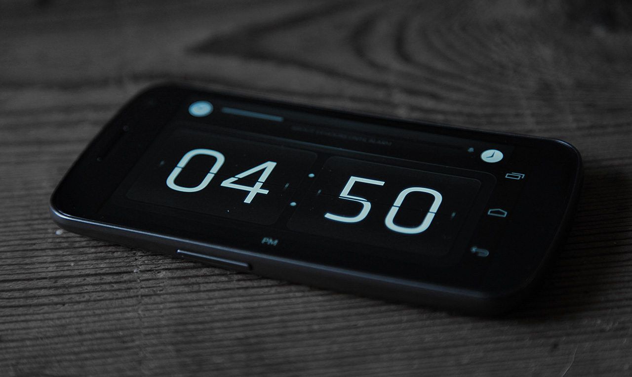
The flip clock uses Klavika, one of the best typefaces ever designed.
Those are just technical considerations, of course. We didn’t rest in ensuring the aesthetics were flawless: from custom typography from world-class designers to applying meticulous care to every corner of the application.

I’d say every designer should design a clock at some point. There’s a lot of ways you can design a clock, and it’s surprisingly difficult to design something so attractive that it is remarkable, yet neutral enough to be liked by a very wide audience. One only has to look at the market for watches to see how intensely personal clock design is. I am still not quite content, and I’ll probably never be: I’ve found designing clocks to be a rather consuming affair.
During the process, I threw away a ton of designs and simply started over. I also touched on this being an important part of the design process in the interview I gave on design.org: when you feel like what you’re working on really needs a little bit extra, you have to realize that — even though you spent so much time on them — your designs are just pixels, and you can probably simply do better. Throw it out. Kill your baby. Start over. It’s made this app what it is today.
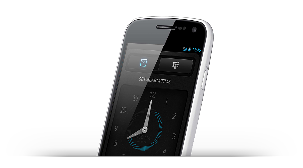
One of many screens we canned. Not Good Enough.
And there’s details. Ah, those lovely little details. We ensured all of its non-clock, alarm setting UI is kept as dark as possible, yet we avoided using strong contrast to prevent hurting your sensitive eyes in the bedroom. The snooze / dismiss interface allows you to easily snooze an alarm if you really need to, but prevents casual disabling of alarms while you’re still too drowsy. It’s… well, designed for humans. All these details seem like such obvious things, yet you’d be surprised to find that nobody seems to have thought about these details before. I sincerely hope our app inspires others to adopt the same design patterns, simply because I believe it makes people’s lives better.

One other key differentiator of the app is the Sleep Cycle feature. Extensive research has been done on sleep, and I don’t think any institution can claim that they’ve truly cracked every secret and all the logic behind dreams and sleep. One thing I knew out of experience, however, is that I and many of my friends and family benefitted greatly from basic rough sleep cycle calculation. It is believed that humans go through several deep sleep cycles in one night, and forcibly waking yourself up while in the depths of one is claimed to leave you more tired and groggy than when you wake up either naturally, or at the end of one. There’s plenty of applications that require you put your phone in your bed to do all sorts of semi-scientific monitoring of sleep patterns using, what I presume, is a mixture of accelerometers, clairvoyance, and magic. We took a different approach.
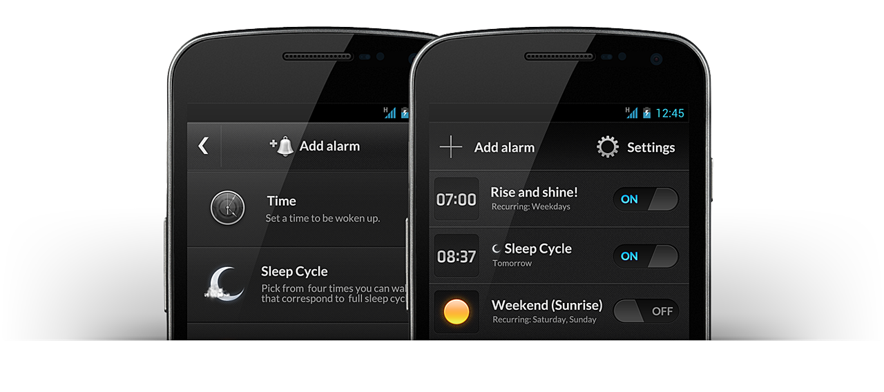
It’s easy to test this for yourself with the app: We integrated a smart system that lets you set an alarm the moment you go to sleep that will tell you when you can wake up to prevent waking up in the middle of your sleep cycle. If you wish to wake up at a specific time, the app will tell you when to go to bed. It’s extremely simple, but using it every day it has made a significant difference in my life. While there is no solid science behind it, thousands of users of the app have reported positive experiences while using the feature.
I also prefer this approach to using sleep cycles as I prefer to sleep with my wife, not my phone.

A great process never ends, of course: there’s numerous refinements and additions cooking up in our labs. Some more obvious than others. But in a time where people say nothing on Android is designed with care, it was worthwhile creating what is essentially the ultimate antithesis: an app that makes users of another mobile platform wanting — even asking! — for something as nice so that they, too, could use it for themselves.


Comments are closed.